Genuine-product focus
We help you confirm the actual product before an order is placed.
I FIT FORMULA · KOLAR, KARNATAKA
Choose genuine sports nutrition with straightforward support for your training, recovery and everyday wellness routine.
YOUR LOCAL NUTRITION STORE
 TRAIN · RECOVER · GROW
We help you confirm the actual product before an order is placed.
Start with your goal, routine, flavour and pack-size preference.
Ask for current availability before making a payment decision.
Share your town and pin code to confirm delivery possibilities.
Find what you need
A better way to choose
Different supplements support different routines. Use these quick paths to narrow the catalogue, then ask us to confirm the right product, available flavour and pack size.
For people who want a convenient protein option alongside regular meals and training.
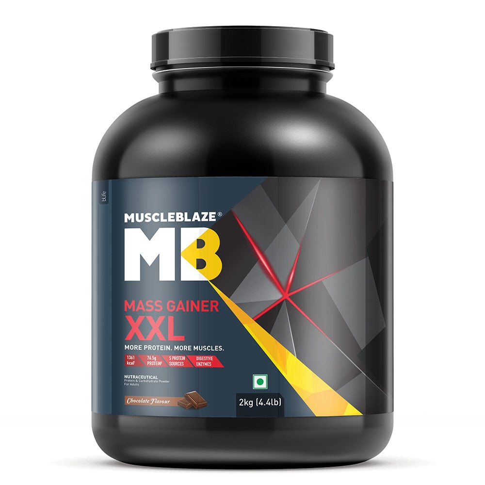
Explore whey protein →Explore higher-calorie mass-gainer options and ask us which pack suits your routine.
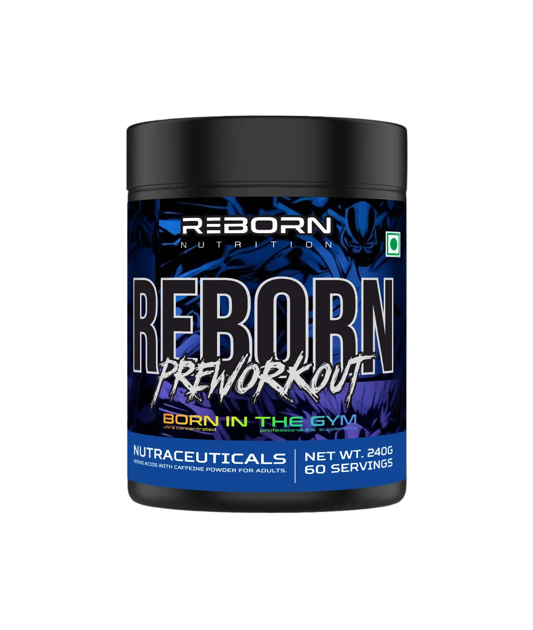
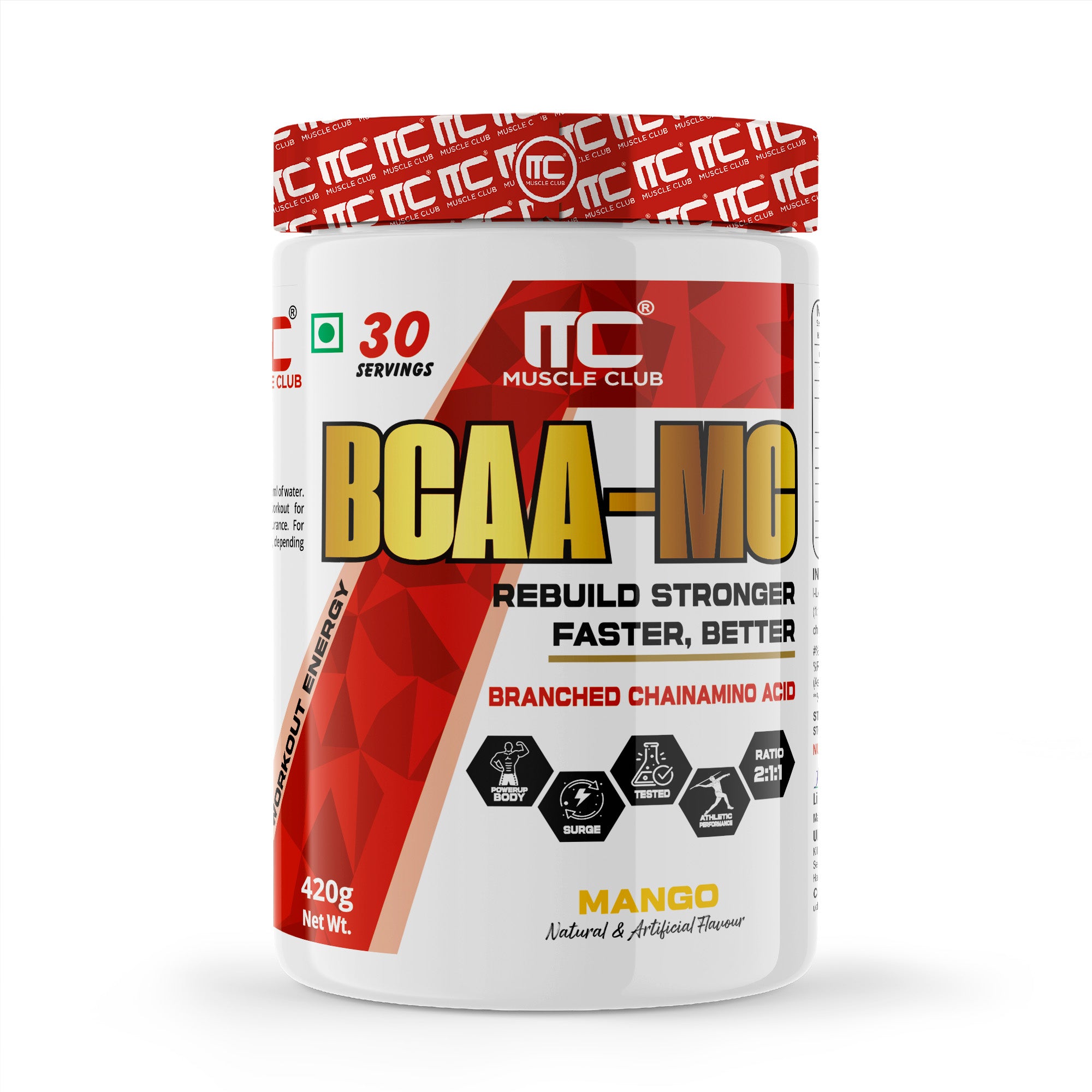
Explore mass gainers →Browse creatine, pre-workout and amino categories based on your training preference.
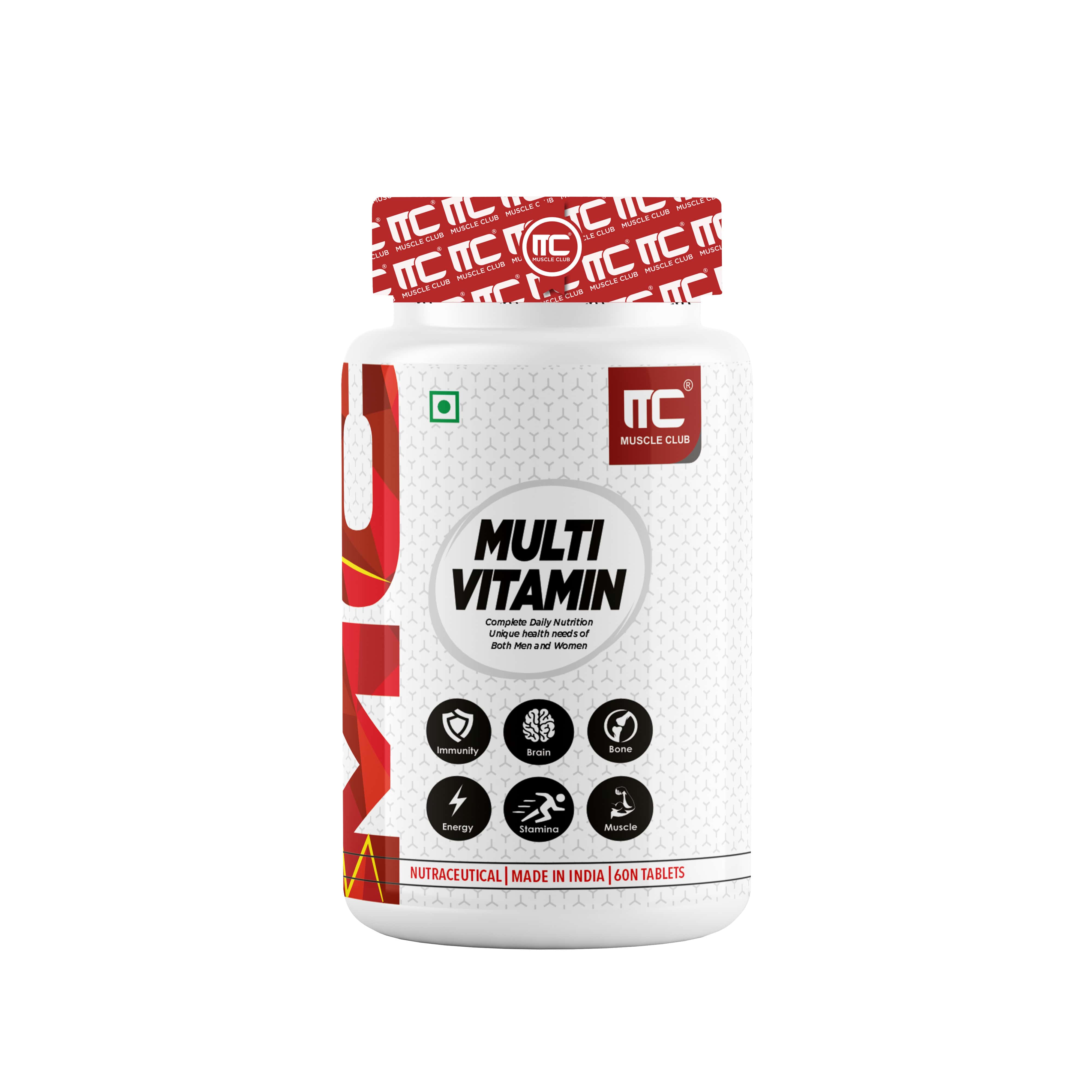
Explore performance →Browse vitamins, fish-oil and wellness categories for your daily essentials.
Explore wellness →Featured in store
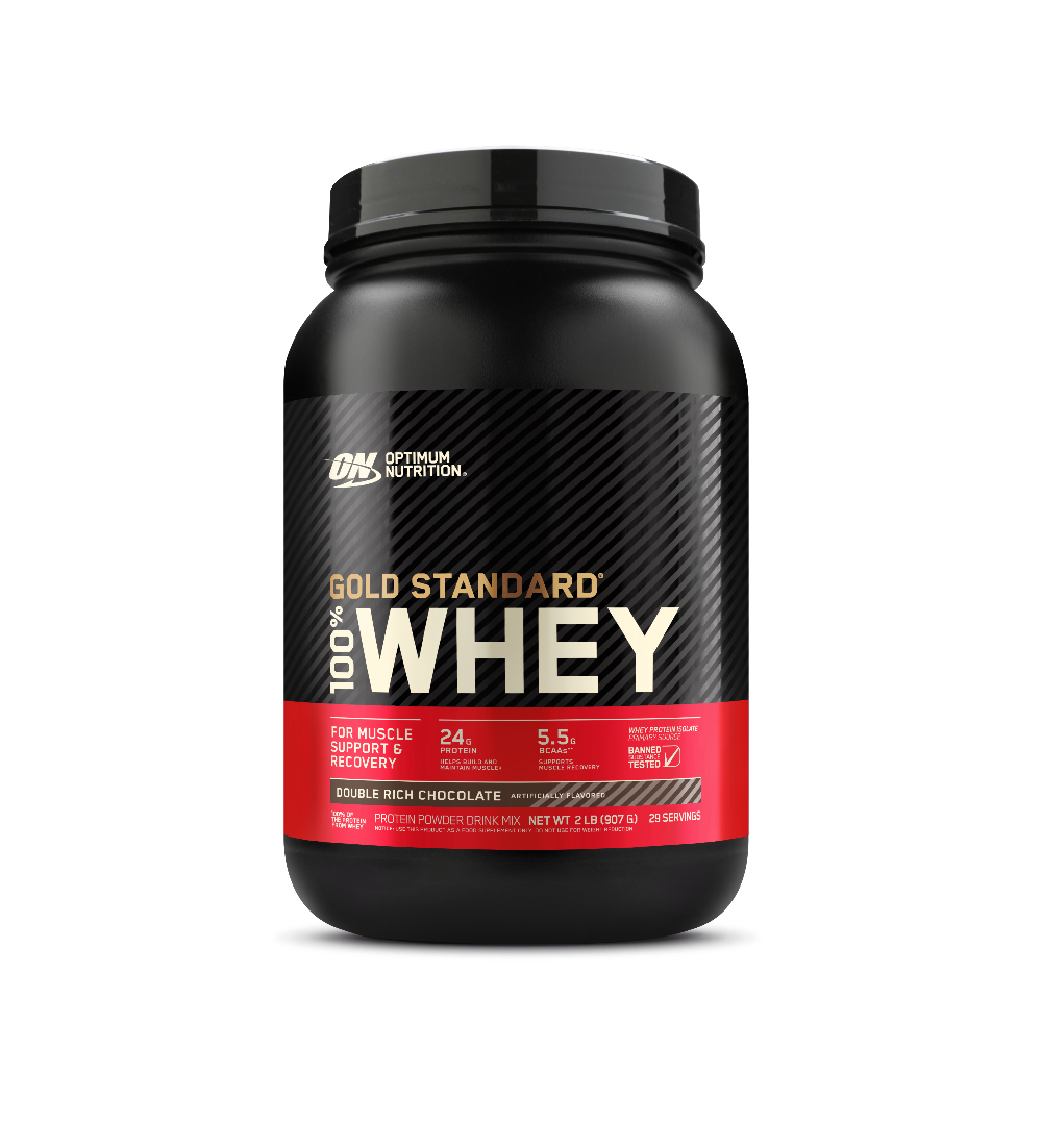
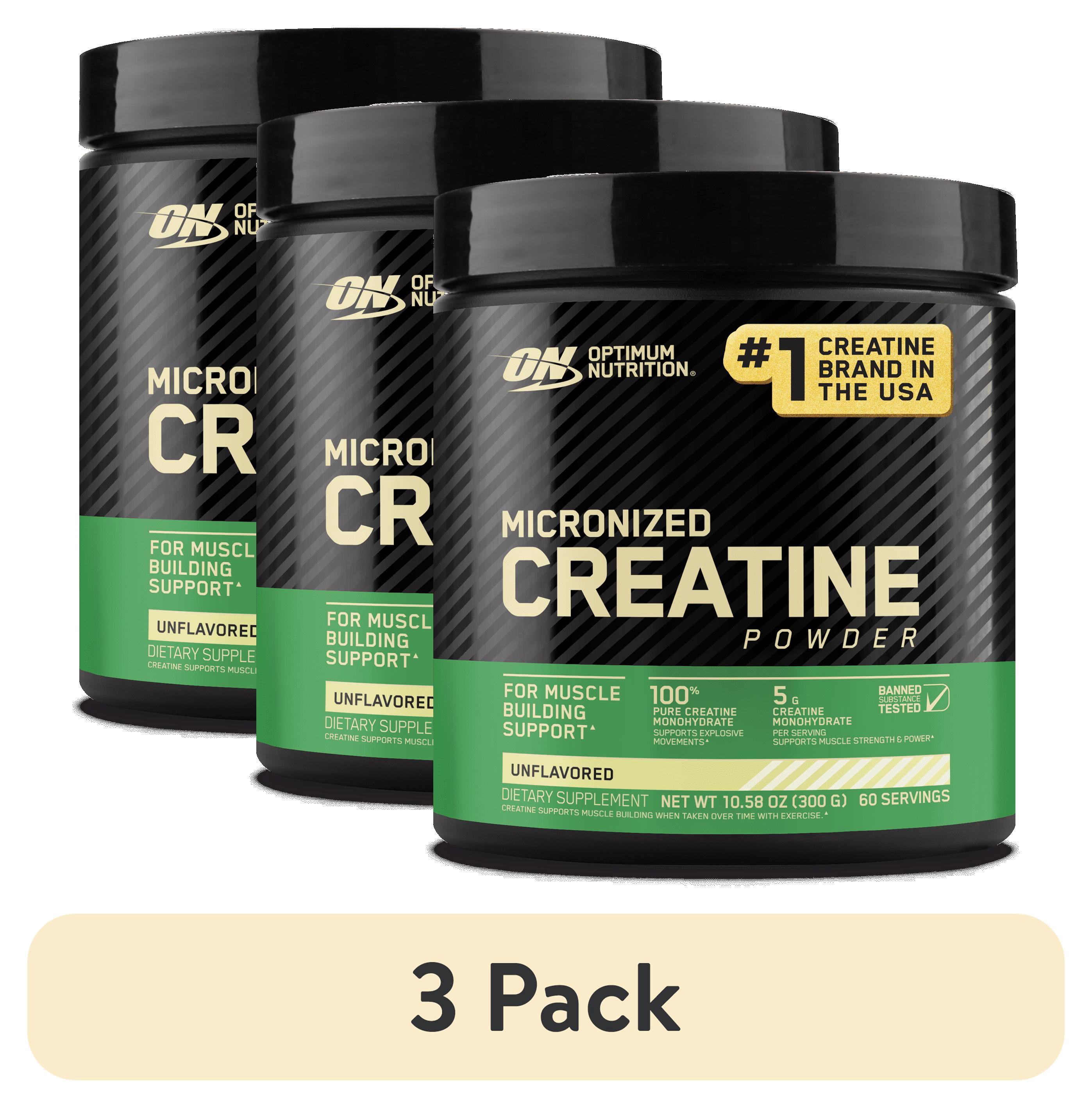
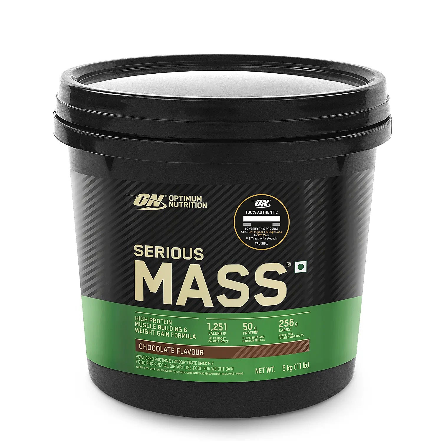
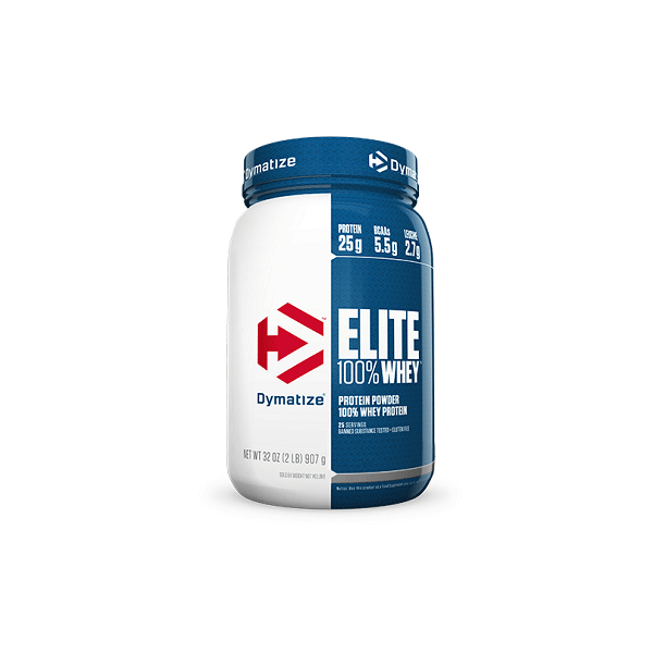
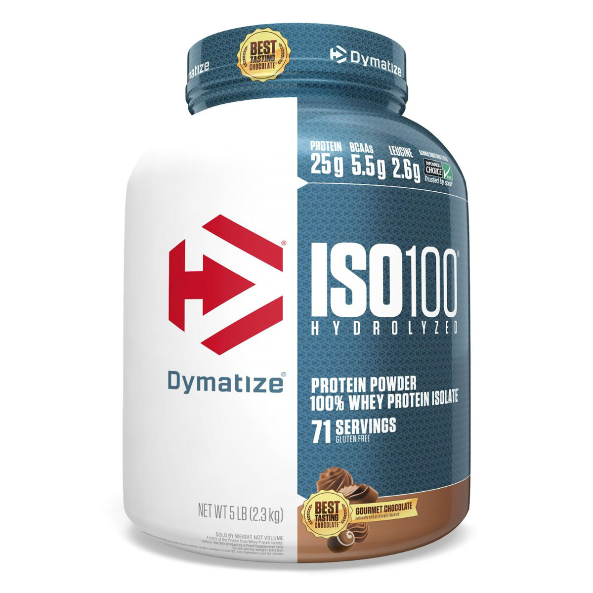

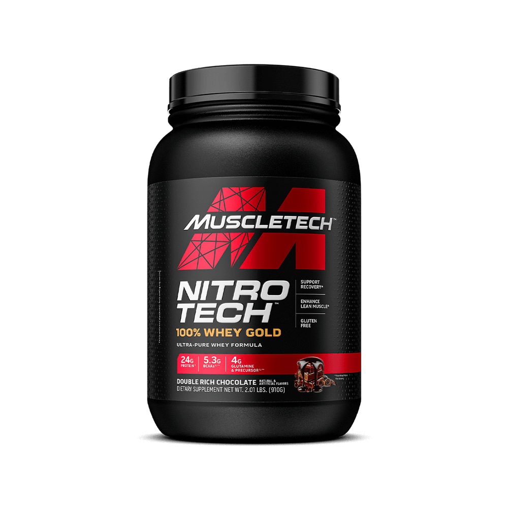
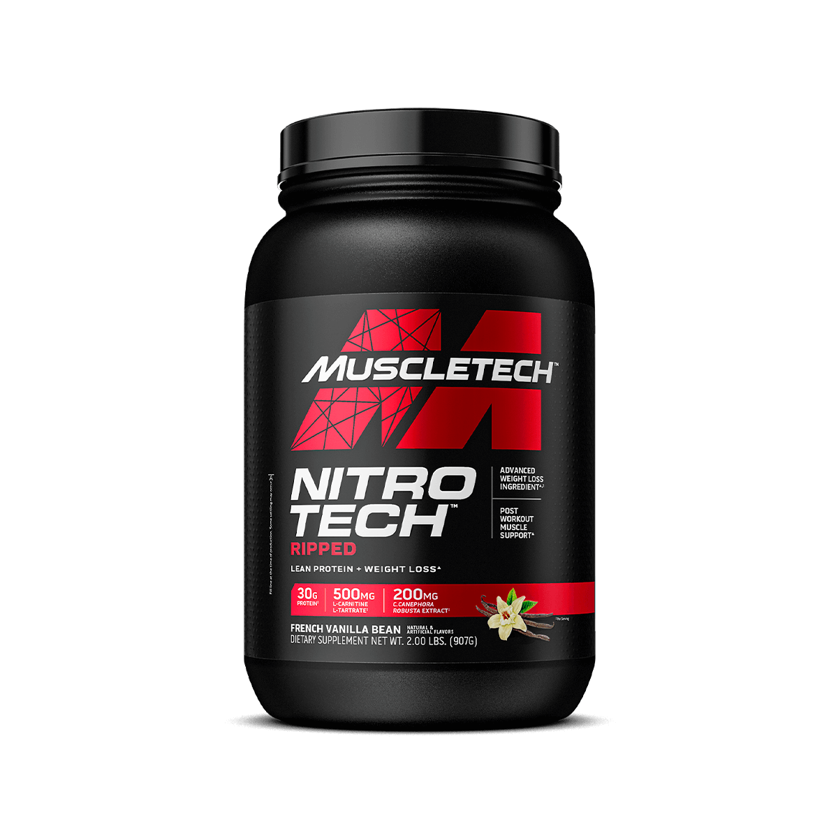
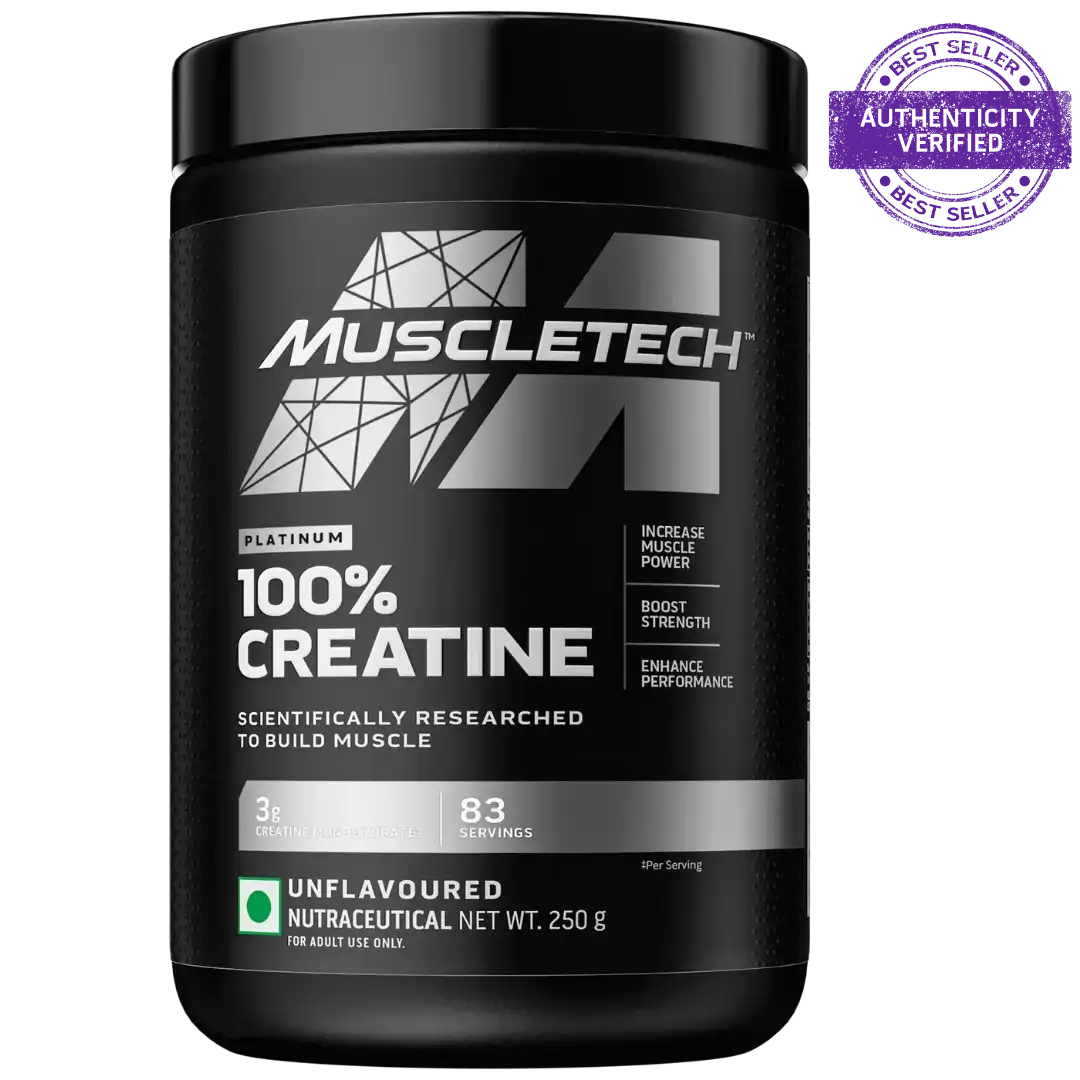
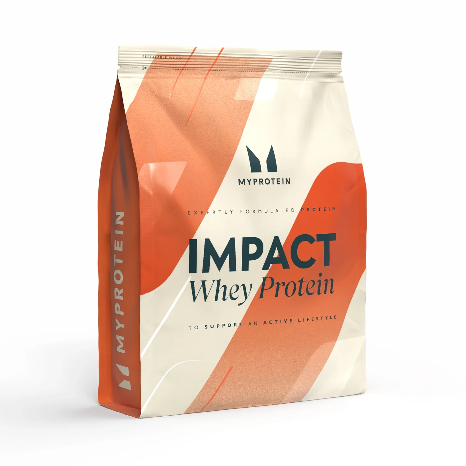
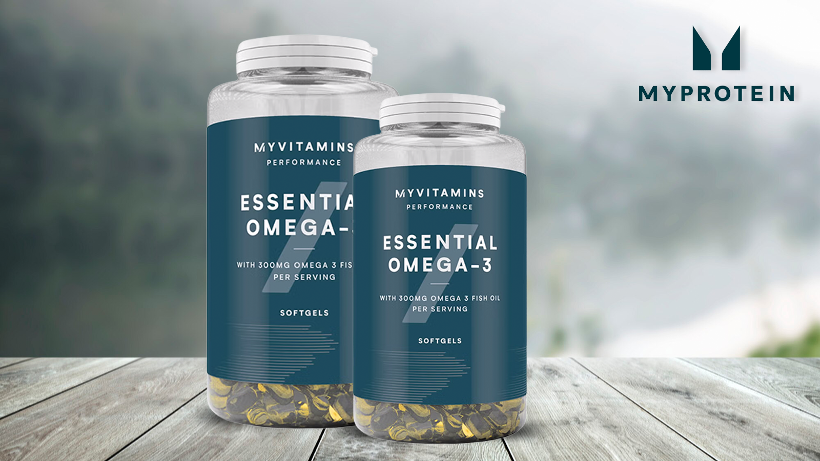

MyProtein
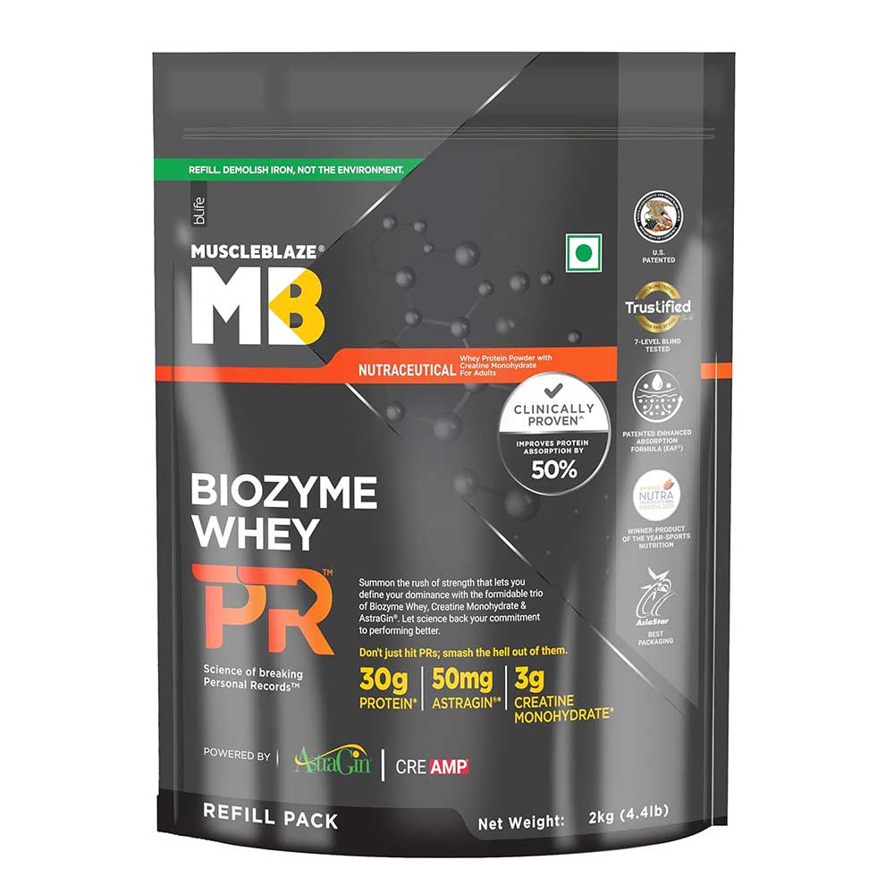
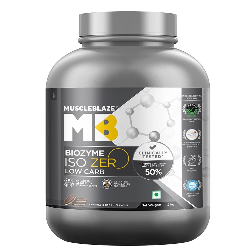
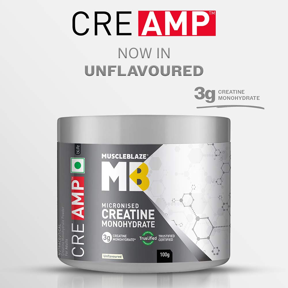
I FIT FORMULA
A simpler way to shop
Before you order
Supplements vary by brand, flavour, weight and batch. That is why I FIT FORMULA keeps the conversation clear before an order is confirmed.
Confirm a product →Whey protein guide
The catalogue follows this requested whey-brand order. Individual products and stock are confirmed separately on WhatsApp.

Personal Trainer · Nutritionist · Entrepreneur
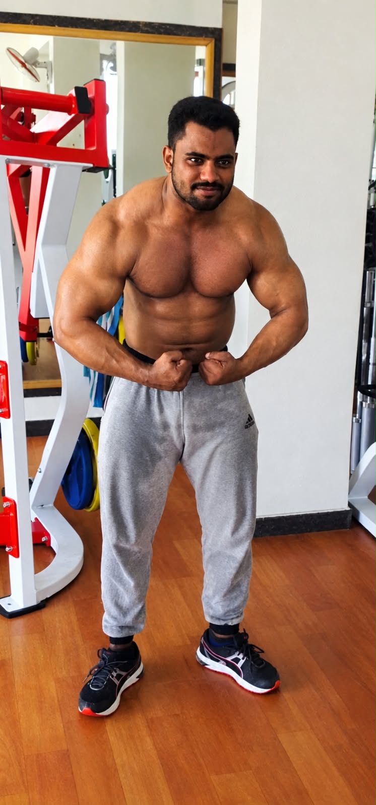
I FIT FORMULA is built around practical supplement guidance—not just a product shelf. Ali Irfan brings a trainer’s perspective to each conversation, helping customers understand which category, pack size and routine can suit their goal.
Share your training plan and preference on WhatsApp before ordering. We will help you check the genuine product, flavour and current availability.
Kolar district support
Send the product name, preferred flavour, pack size and your pin code on WhatsApp. We will help you check current availability and delivery possibilities before you proceed.
Check delivery availability →Delivery availability depends on stock, address and pin code confirmation.
Helpful answers
Start with your goal—protein intake, muscle and weight goals, training performance or everyday wellness. Then send us your routine and preference on WhatsApp for a practical shortlist.
Yes. Please share the product name, preferred flavour and size. We will confirm what is currently available before you decide.
Stock and variants can change, so the store confirms the current product details directly before an order is placed.
We take enquiries from Kolar, Srinivaspur, Mulbagal, Bangarpet, Malur and nearby locations. Delivery options are confirmed using your address or pin code.
Call or WhatsApp +91 92060 14393. WhatsApp is best when you want to share a product name, flavour, pack size or delivery location.
Products should be chosen carefully based on your own needs. For medical conditions, pregnancy, medication use or other health concerns, consult a qualified healthcare professional first.
Shop with confidence
We help you confirm the product, flavour, pack size and current stock before you place an order. No confusing claims, no random recommendations.
Talk to the store →Browse the actual catalogue and check availability directly with us.
Tell us your training plan and we will help you shortlist the right category.
Enquire from Kolar, Srinivaspur, Mulbagal, Bangarpet, Malur and nearby areas.